 Follow Nordpil on Twitter!
Bearings from MatLab data to Illustrator, via ArcGIS

 As I wrote in a previous post - my main
workflow is to put all the data together in ESRI
ArcMap (ArcGIS 10) and then export to Adobe Illustrator for final
graphic design - so I get a neat vector graphic for print use.
As I wrote in a previous post - my main
workflow is to put all the data together in ESRI
ArcMap (ArcGIS 10) and then export to Adobe Illustrator for final
graphic design - so I get a neat vector graphic for print use.
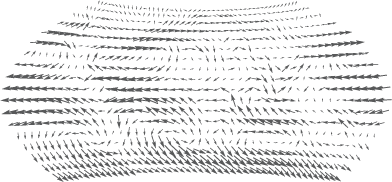
The projects that I enjoy most are those where I work with scientists and get the model output - gis data or similar - (this time from MatLab) and then prepare a nice presentation with clean cartographic design and powerful communication that is easy to understand.
I am currently working with the Stockholm Resilience Centre on a book on water and agriculture, and one figure had a world map with little arrows all over. The arrows represent moisture circulation around the world - in both strength (length of arrows) and direction. The book will be published by Cambridge University Press in the fall of 2012.
The data was exported from MatLab in ASCII Grid Format, which I could easily bring into ArcGIS. There were two attributes - the North-South component as well as the East-West component. It took some research into trigonometry and polar coordinates to recalculate this into two new parameters - one with the angle and one for the strength. A little bit of Python math in Field Calculator worked fine, once I had combined (the Combine Spatial Analyst function) the data and exported it to a point dataset.
Now came the tricky part - I needed to find a way to export this from ESRI ArcGIS to Illustrator in a way so that I could have full control over the symbols. I didn't want to export the symbols directly, since that would have locked me in a bit.
What I did was to create a set of point symbols - using multiple attribute symbology - and symbolize the strength of the circulation with circles of different size (5 classes) and then symbolize the directions with a gradient from white to black - starting at 0 degrees as white up to 360 degrees as black.
In Illustrator I then used the Find and Replace Graphic - transform to fit that I had previously downloaded from Nat Kelso's website/blog. The script is originally from John Wundes, it might be this one. I drew a little arrow and ran the script - yes this worked very well with the sizes - replacing the different sized circle symbols. Now I needed a way recalculate the white-black gradient to rotate the symbols. I also needed the arrow symbols to keep their dimensions, instead of being scaled to a circle.
Enter this hacked Adobe Illustrator JavaScript! I added two toggles to the script in the top - onlyScaleWidth and rotateObject. If you need to use this, you may need to adapt the script further, since I didn't have the energy to take all cases into account - I prepared it specifically for this map.
In the end, I got a very nice piece of cartography. But I have one problem with it - I reprojected the map/data to Wagner VII projection - using GlobalMapper, since ArcGIS does not support this projection. But the bearings are not reprojected to show the compass direction relative to the North in the resulting map. Any tips for how to do this using ArcGIS are welcome! I added a note to the caption of the graphic that the compass directions are relative to the paper, and not the map...
Download findandreplacegraphic_transformtofit_height_color.jsx [3 KB]