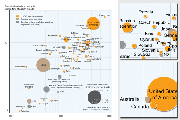
Carbon dioxide emissions and wealth
Map illustration for the UN report Catalysing change - the UNECE response to the climate countdown.
This complex chart presents several issues in relation to climate change and emissions of carbon dioxide (CO2). The amount of information contained in a diagram of this type is very high, and it represents dense information, suitable for a skilled and scientific-minded audience that has time to study and interpret the chart. The illustration was prepared integrating multiple data sources relating them to each other and recalculating the figures.
Microsoft Access, Microsoft Excel, Golden Software Grapher and Adobe Illustrator were used to prepare the map.
The data source for the emissions data is the CDIAC carbon dioxide emissions database, while the financial figures were retrieved from World Development Indicators Online (WDI).
For more information, please refer to:
- United Nations Economic Commission for Europe (UNECE)
- Full report download
- The report is also listed in the Nordpil portfolio/publications list.
- Emissions data from CDIAC.
- World Development Indicators Online (World Bank)
Do you need powerful, clear and good-looking illustrations?
Nordpil specializes in creating the best maps, charts and diagrams for high-profile publications, please contact us and describe your needs, and we will get back to you with a quote.
Would you like to learn how to prepare better maps, charts and diagrams?
In our training workshops you will learn about the theory about creating powerful visual material based on scientific data and statistics, and we discuss and deconstruct examples from recent publications, news and your work. Read more on our workshop pages.
 Follow Nordpil on Twitter!
