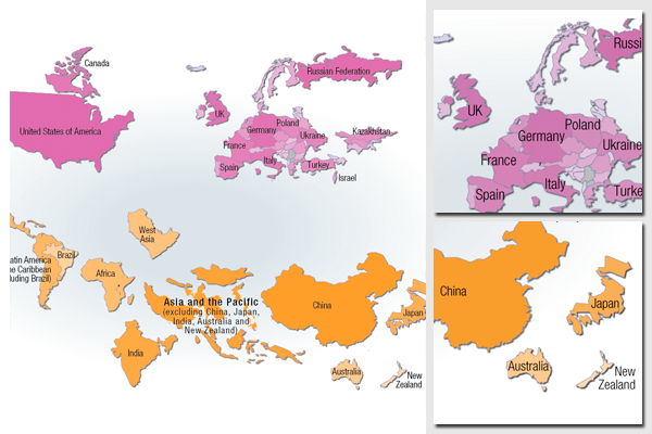
Cartogram over greenhouse gas emissions, UNECE members and other countries/regions
Illustration for the report Catalysing change - the UNECE response to the climate countdown.
Cartogram (or anamorphic map) with the size and area of every country/region scaled to reflect the carbon dioxide emissions in 2007. The top part of the illustration shows the UNECE member states, while the lower part presents other countries and regions for comparison. The map data was edited in places by moving certain countries and loosening the topology, to avoid overexaggerated distortion.
ESRI ArcGIS and Adobe Illustrator were used to prepare the map, together with the Cartogram Geoprocessing tool.
The data source for the emissions data is the CDIAC carbon dioxide emissions database.
For more information, please refer to:
- United Nations Economic Commission for Europe
(UNECE)
- Full report download
- The report is also listed in the Nordpil portfolio/publications list.
- Emissions data from CDIAC.
Do you need powerful, clear and good-looking illustrations?
Nordpil specializes in creating the best maps, charts and diagrams for high-profile publications, please contact us and describe your needs, and we will get back to you with a quote.
Would you like to learn how to prepare better maps, charts and diagrams?
In our training workshops you will learn about the theory about creating powerful visual material based on scientific data and statistics, and we discuss and deconstruct examples from recent publications, news and your work. Read more on our workshop pages.
 Follow Nordpil on Twitter!
