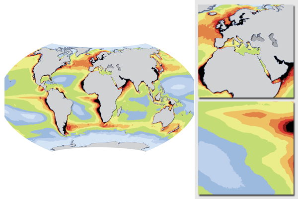
World map of ocean productivity
The unit used in this global map is the annual Net Primary Productivity (NPP).
Map prepared for the UN Environment Programme (UNEP) publication Poverty & Environment Times #5, published in 2008, and included in the 2008 UNEP report In dead water - climate change, pollution, over-harvest, and invasive species in the world's fishing grounds.
Prepared from global scientific data acquired from Oregon State University and derived from SeaWIFS. The data were reclassed and summmarized and projected to Wagner VII projection, providing an equal-area view of the world.
ESRI ArcGIS, Saga GIS and Adobe Illustrator were used to prepare the map.
For more information and downloads, please refer to:
- Natural resources - marine resources at UNEP/GRID-Arendal maps and graphics library
- Poverty & Environment Times #5
- In dead water - climate change, pollution, over-harvest, and invasive species in the world's fishing grounds
Do you need powerful, clear and good-looking illustrations?
Nordpil specializes in creating the best maps, charts and diagrams for high-profile publications, please contact us and describe your needs, and we will get back to you with a quote.
Would you like to learn how to prepare better maps, charts and diagrams?
In our training workshops you will learn about the theory about creating powerful visual material based on scientific data and statistics, and we discuss and deconstruct examples from recent publications, news and your work. Read more on our workshop pages.
 Follow Nordpil on Twitter!
